Slack
Salesforce’s productivity platform
Slack is a messaging app for business that connects people to the information they need. By bringing people together to work as one unified team, Slack transforms the way organizations communicate.

Company: Slack, Salesforce
My role: Senior Product Designer
Duration: Nov 2021 - Jan 2023
Tools used: Figma
Background
I joined Slack in November 2021 shortly after Salesforce completed the acquisition of Slack. I work on Team Expansion, focusing on Trials & Upgrades and the Purchasing experience.
Case study 1: Custom Trial Themes
Goals
Increase the conversation rate from trial to paid users. We aimed to achieve this by enhancing user awareness and engagement during the trial phase.
Problems
In the current trial experience, users aren’t always aware they are on a trial, and we lose the opportunity to demonstrate the benefits of the paid plan to encourage them to upgrade after the trial ends. This led to reduced conversion rates as they weren’t fully experiencing the platform’s potential.

For the user journey mapping, I identified critical touch-points where users can be informed of key information. I started with six potential placements, considering their prominence. In the initial stage, I explored every possible location to notify users about their trial status. The goal is to assess all use cases and determine the optimal solutions through comparison. I began with these six placements, acknowledging their varying levels of prominence.
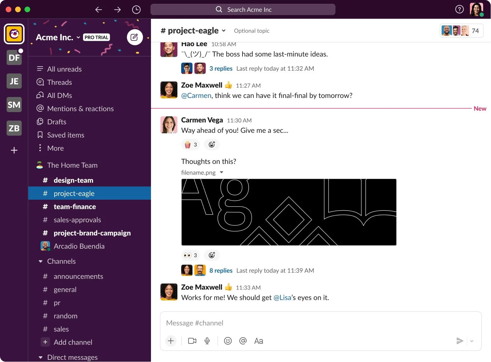
Adding illustrations to the entire Slack theme (high-level theming)
Adding a Trial badge to the workspace header
Adding a Trial badge next to the Upgrade button in the profile
Adding a confetti illustration to the top navigation bar
Adding visual indications to the workspace panel
Adding a Trial badge next to the workspace header in the Team menu
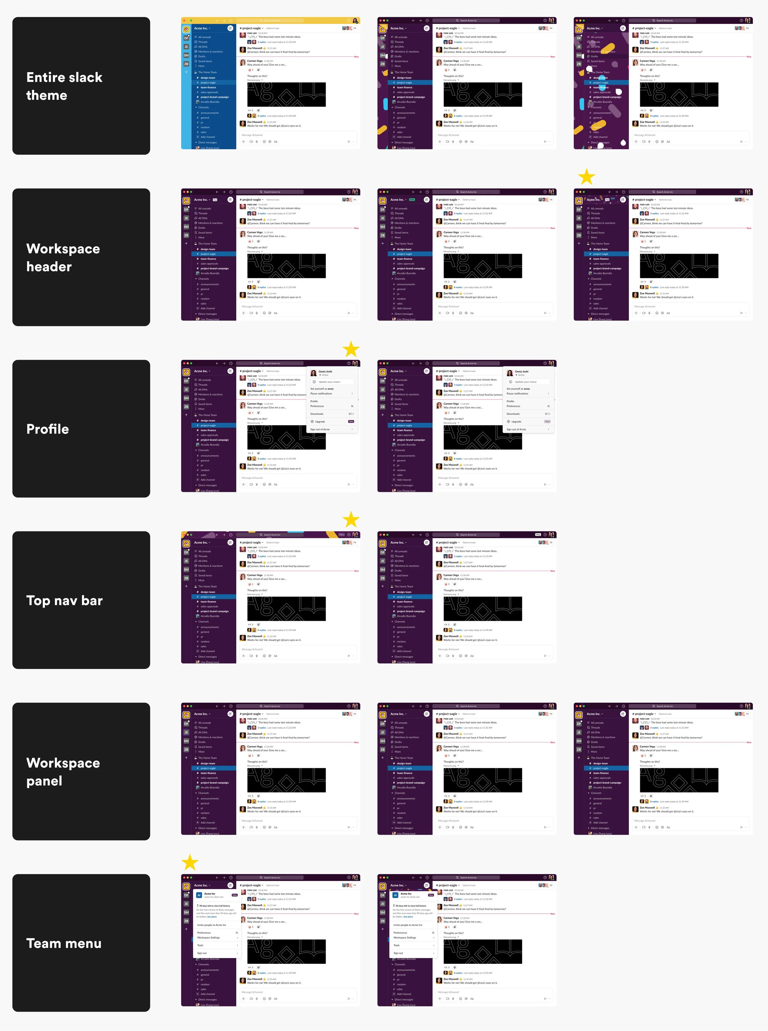

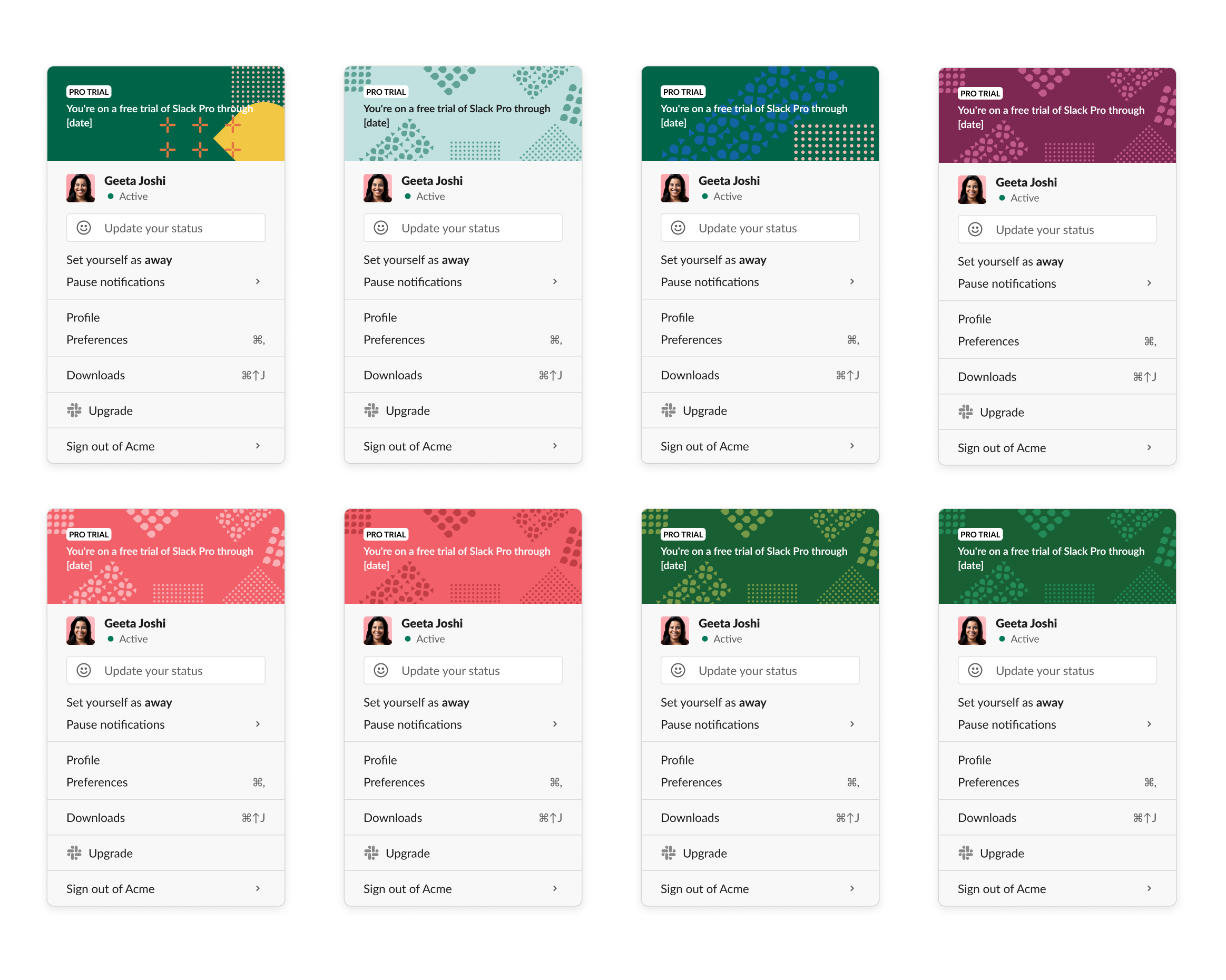
Once I had the first low-fidelity mocks ready, I shared them with the Commitment Team designers to gather their input. We found the profile and team menu areas quite promising but in need of further polish in terms of visuals and copywriting. The initial design didn't sufficiently emphasize the Trial themes and lacked visual prominence since it was already one level beneath. It's important to ensure users pay attention to this aspect. With that in mind, I continued exploring, focusing on layout and copy adjustments.
Moving forward, I involved our content designer to improve the copy for clearer communication of the trial experience. It's crucial to convey the concept clearly without causing confusion.
We collaborated closely to align the text and messaging with our design goals, refining both the messaging and layout within the team menu and profile menu.
To maintain a cohesive user experience aligned with Slack’s brand style and guidelines, I utilized their branding illustration library. The goal was to evoke specific emotions associated with the trial experience: excitement, achievement, curiosity, and trust. I selected elements that fit these objectives, exploring themes such as Celebration, Abstract, Spaceship, and Plants. These illustrations were chosen carefully to resonate with these emotions and enhance user engagement.
Accessibility considerations were paramount, ensuring color choices met accessibility standards to accommodate all users. Distinct, attention-grabbing colors were used to differentiate trial elements from the rest of the UI.
Icons, badges, typography, and subtle animations, like shimmering effects, were employed to emphasize trial status and engage users. Clear and actionable CTA buttons with prominent placement were designed to ensure ease of use and accessibility.


The project was initiated by the design team with the goal of presenting it in Q4 Grooming. We've received positive feedback from Expansion designers and Engineers who reviewed the project. I had planned to share the spaceship launching illustration with the marketing team for final polishing.
For user testing, our plan includes conducting A/B testing to gauge preferences and responses, iterating based on the results. Collaborating closely with engineers, we'll implement design elements to ensure functionality and monitor user interactions, making adjustments as needed.
To track user engagement and trial awareness, we'll implement tracking tools. Analyzing the data will help assess design effectiveness and guide data-driven improvements. Although I didn't complete the project during my time at Slack, it remains one of the most exciting projects I've worked on.
Case study 2: Team Menu Message Counter
Goals
Inform trial team users about the 90 days of messages history and file storage changes in the Team menu.
Background
Starting September 1, 2022, we're simplifying limits for the free plan. Instead of a 10,000-message limit and 5 GB of storage, we're giving full access to the past 90 days of message history and file storage.

Original in Product, designed in 2020
1. Trial Eligible Team:

Day 1 -The goal is to communicate 1) free teams have a limit 2) communicate how close they are to reaching this limit
Day 2-83
Visual indicator counting up to 90 days
Upgrade CTA shown, would never show Trial CTA until day 83Day 83-89 - last week before limit reached
Switch from “approaching 90 days” counter with Upgrade CTA -> “You’re approaching your limit!” Trial Start CTA
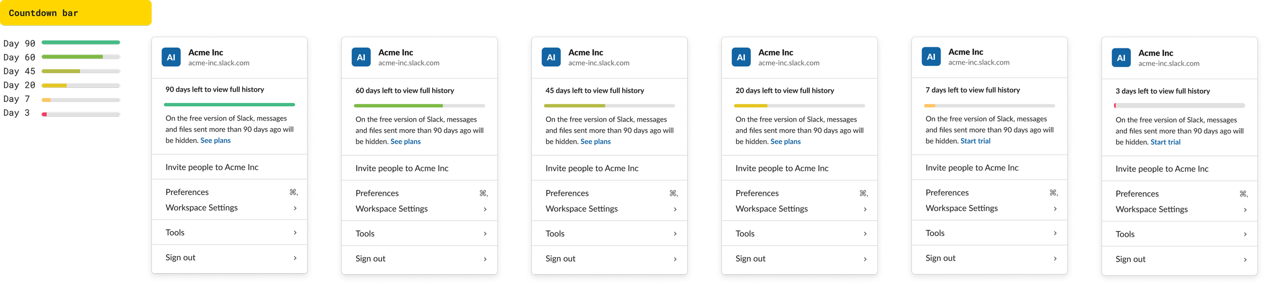
Days 90+: Limit reached, post-limit reached
Day 90+ - goal is now to communicate 1) you’ve reached your limit 2) talk about # of messages hidden
Show trial CTA until ANY trial post-GG is started
If team starts a diff feature trial (Huddles, Slack Connect) change this Trial CTA here -> Upgrade CTA


2. Active Trial Team:
3. Trial Ineligible Free Team:

Number of messages
